Navigation
Install the app
How to install the app on iOS
Follow along with the video below to see how to install our site as a web app on your home screen.
Note: This feature may not be available in some browsers.
More options
You are using an out of date browser. It may not display this or other websites correctly.
You should upgrade or use an alternative browser.
You should upgrade or use an alternative browser.
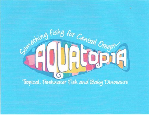
My new fish store logo.. your thoughts
- Thread starter antithesis123
- Start date
Motherlode Chameleon
Chameleon Enthusiast


Looks neat I would not mind seeing your place. What kind of fish do you prefer?
KTown333
New Member
Baby Dinosaurs? huh? I have a B.F.A in Art so hopefully my opinion counts. I think it is ok but not out of this word, like it should be. I feel like if I had my own business I would want to logo to be flawless. You'd be better off designing it yourself or getting a pro, but if you like what that person did then great . The spacing of the letters is messed up. The T is poking out of the top of the fish. The way the logo gets small at the tail make it hard to read the logo. Not only is that not very effective, I would also play around with some different fonts. Also the name Aquatopia is weighted to far to the right on the logo. It needs to be centered or something, flow with the lettering above and below it. I think this logo has potential but it is not that great in my opinion. Go for sharper more defined, deep colors. To many dull hazy colors in the logo. The light blue background is nice. Sorry if I seem too tough but these are all things my Graphic Design professor would tell me if that were my logo. I wouldnt throw it our as a logo but I wouldnt keep it either. Aim for greatness! Exp when your name is on the line. PM me if you need any other artistic tips : )
. The spacing of the letters is messed up. The T is poking out of the top of the fish. The way the logo gets small at the tail make it hard to read the logo. Not only is that not very effective, I would also play around with some different fonts. Also the name Aquatopia is weighted to far to the right on the logo. It needs to be centered or something, flow with the lettering above and below it. I think this logo has potential but it is not that great in my opinion. Go for sharper more defined, deep colors. To many dull hazy colors in the logo. The light blue background is nice. Sorry if I seem too tough but these are all things my Graphic Design professor would tell me if that were my logo. I wouldnt throw it our as a logo but I wouldnt keep it either. Aim for greatness! Exp when your name is on the line. PM me if you need any other artistic tips : )KTown333
New Member
Also when creating a logo. Imagine what it is going to look like on a little piece of paper at like 25% size. Like a letter head or something. Is the logo still going to read well when it is shrunken down to a small size? Is it going to look good when it is blown up big? Also color variants are something to think about. Have same logos but in different color schemes. Also be careful with logo background. Is your logo still going to look good printed on white paper with no light blue in the back? Or will it lose its detail on different colors. I would have it so it looks good on any color. If you have a light blue background for your logo where will the background color end if you are printing on white paper? You will need like a square or circle shape of background color to encase the logo. Is the logo still going to look good like that? Sometime that can look odd. Good luck! Art is my life
antithesis123
New Member
Thanks for the input - the logo is a done deal, good points though, I'm super happy with how awesome it turned out! Were going to specialize in the more exotic freshwaterfish- puffers, african and amazon riverfish, eels, some of the cooler cichlids, mudskippers, invertebrates and the like_- well have all the regulars too but our town only has the big stores. There are a few really cool reptile stores here in bend but ill also do some too- just nothing that would intimidate a mother. You can imagine what reptiles ill be selling though were looking forward to promoting education and this site among others for good info- really though were going to be a happy little mom and pop shop
sagemoon2004
Established Member
I think it looks very sharp! Congratulations on the business. My husband and I are buying the local pet supply store here, mom and pop, too. I have been the manager for 10 yrs, this is a dream come true for us, hopefully retirement someday, as well. My son is working on our logo, he is into graphic design and works at a local firm. Best of luck with everything, it is daunting, but exciting as well!!!!
antithesis123
New Member
I think it looks very sharp! Congratulations on the business. My husband and I are buying the local pet supply store here, mom and pop, too. I have been the manager for 10 yrs, this is a dream come true for us, hopefully retirement someday, as well. My son is working on our logo, he is into graphic design and works at a local firm. Best of luck with everything, it is daunting, but exciting as well!!!!
Congratulations to you! I'm from grand rapids originally and my wife is from bay city! Were starting from the ground up and its a whole lot of work! but I say power to the little people, nothing ventured, nothing gained!
Good luck with your logo too! Wish we were closer, we all could have dinner
antithesis123
New Member
i am a fish person and i truly like itt!!! very nice!
Thank you so much! Man, some thing seem like such a shot in the dark when you've never done them before!
Elizadolots
New Member
Consider creating variations of it for different situations, to address the concerns Ktown expressed.
For instance, for letterhead, you could use the fish as is, but convert the type to the blue color so it works on white paper.
You might want to create bumper stickers, in which case, you could keep the existing color scheme, but pull the list of animals off to the side and enlarge it.
Stuff like that.
panthercham
New Member
Wow! I use 99 designs a lot for logos for my websites and ecommerce stores and I am always happy with the results but then I really push them and give them feedback to change and tweak the designs until I am happy as $295.00 for a logo is expensive and I expect a lot. If you want examples of some of the ones that I have chosen then pm me for them so you can see the difference.
Honestly with ecommerce you have to be so professional and that design is not. Its sloppy and unprofessional on so many levels. They have cut corners and been lazy because this is your first design with them or you have not provided feedback on what will work.
Has the project expired or is there still time remaining? How many entries did you receive over the the week?
Even if you took the basic package of $295.00 you should have expected a lot more and received more.....I get those kind of designs for $15.00 - $25.00 and that is all that design is worth because it doesn't work on so many levels and you will find that out when you get it on a website. It wont look right.
Another thing to remember a logo just does not end up on a website....it ends up banners, on a business card, tshirts, blogs etc.
Sorry to be a downer but you could have gotten a lot better from them.
Last edited:
antithesis123
New Member
Gulp... Gasp.. We did do a wjole lot of tweaking with the designers. We had over 50 submissions and we picked our favorite! I like it a lot and it works with a blue or black or white background! I may darken the outline of the letters- but look, it appeals to both children and adults- its a fish it has a modern feel to it, its friendly and colorful- the lettering is exactly the way I want it and WOW. It has nothing at all to do with a darwin fish, now that's a huge stretch! I was very pleased with the interaction and outcomes of 99designs- for this, I have a logo I like. It will look great on our sign too! Even t shirts! I don't know how 50 artists collectively ripped me off or why you would even say that elizadots
KTown333
New Member
Sorry to be so critical about your logo. I didnt know it was a finished product. None the less it is still a great logo and I know it will bring you lots of success I am just prone to pick out all those little things to think about and critique. If you are happy with it then that is all that really matters. Have fun in the world of Aquatopiaaaaa! P.S - I woulda done the logo for 2 bags of cricket crack JK!
I am just prone to pick out all those little things to think about and critique. If you are happy with it then that is all that really matters. Have fun in the world of Aquatopiaaaaa! P.S - I woulda done the logo for 2 bags of cricket crack JK!Elizadolots
New Member
I suspect anyone who would a) make the connection to the Jesus Fish and b) be offended by it probably doesn't keep fish because of some religious objection anyway.
antithesis123
New Member
I will also sell red devil fish! Lol.
Ktown - much respect! I know that you are sharing your knowledge and passion for what you do and all of you are too answering what I asked for anyway...your thoughts!
I still never in amillion yrs would have thought of the darwin fish! I have one of those in a fishlike ufo on my car-it just says "aliens"
. Ktown - much respect! I know that you are sharing your knowledge and passion for what you do and all of you are too answering what I asked for anyway...your thoughts!
I still never in amillion yrs would have thought of the darwin fish! I have one of those in a fishlike ufo on my car-it just says "aliens"
Similar threads
- Replies
- 6
- Views
- 707
- Replies
- 3
- Views
- 383
- Replies
- 5
- Views
- 806
- Replies
- 6
- Views
- 937